How to Style Flower Pots for Birthday
I used to stare at party pots that looked like afterthoughts.
The porch would feel tidy and empty at the same time. I wanted planters that read as a gift, not just a cluster of blooms.
I learned to think in weight, color repeats, and small, personal accents. It made arrivals feel intentional.
How to Style Flower Pots for Birthday
I’ll show how to arrange pots so they read like a small birthday display. It’s simple to repeat and gives a cozy, intentional welcome.
What You’ll Need
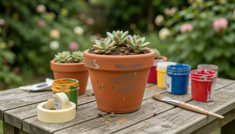
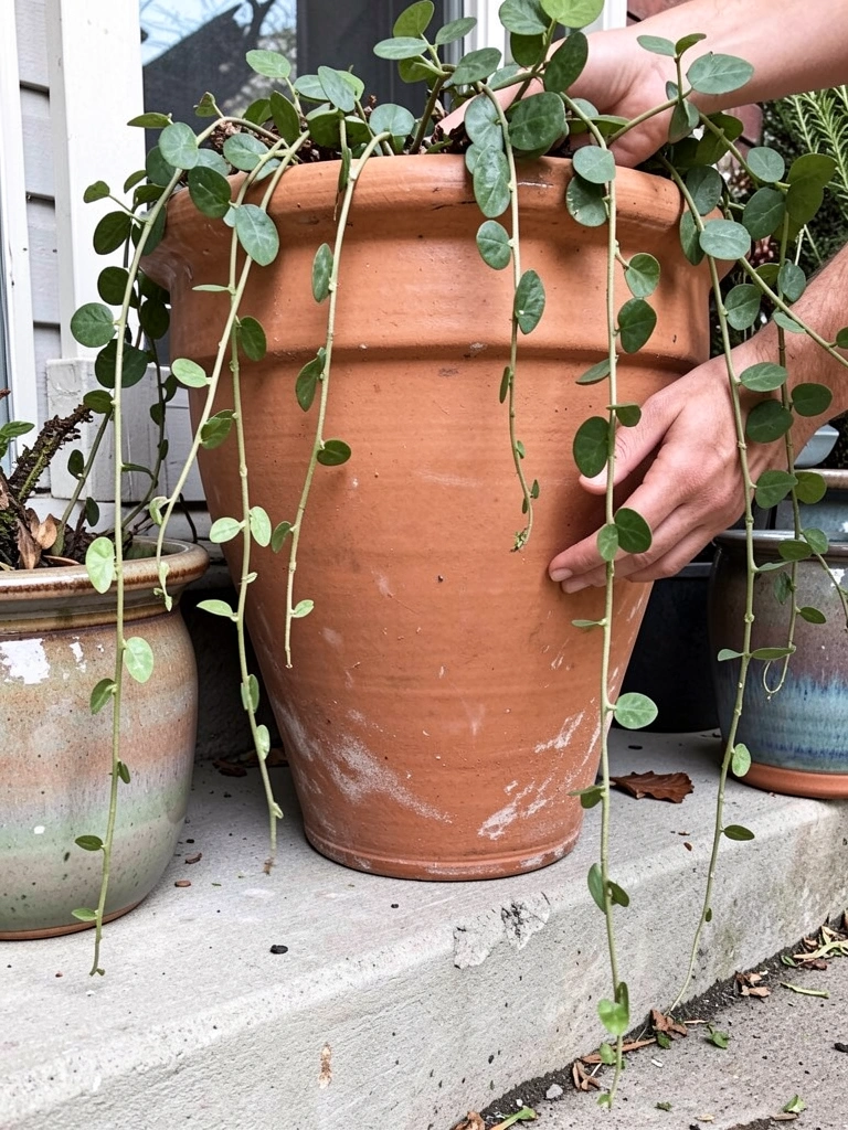
- Large terracotta planter (12–14" diameter, unglazed)
- Two medium glazed ceramic pots (8–10", mixed matte and glossy finishes)
- Small enamel planter (4–6", neutral color)
- Trailing plant (ivy or calibrachoa, compact habit)
- Compact flowering plants (geraniums or pansies, 8–10" spread)
- Filler foliage (dusty miller or lamb’s ear, soft texture)
- Natural moss sheet (dried, green, for topping)
- Satin ribbon (1" wide, color to match blooms)
- Small wooden gift tag or card (handwritten note)
- Battery tea light (warm white, optional)
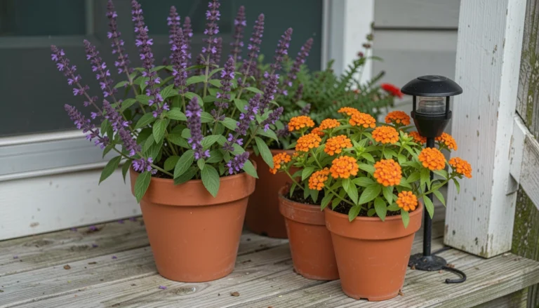
Step 1: Choose a strong focal pot and let it anchor
I pick the largest pot as my anchor. A terracotta pot with a little wear reads as grounded and familiar. I let that pot set the scale for everything else.
When it’s in place the rest of the planters feel deliberate. The eye lands on one point first, then moves to supporting pots. That calm order makes the display read like a present.
People often think the focal has to be the brightest. I miss that it just needs presence. A mistake I make sometimes is placing everything in a straight line. That flattens the composition.
Step 2: Pick a simple color story and repeat it
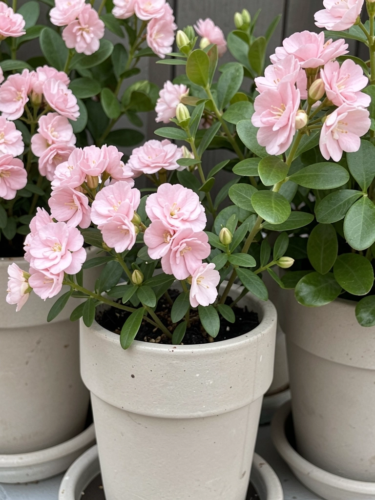
I choose two main colors and one accent. For a birthday I usually pick one warm bloom and one cool foliage tone. Repeating those colors across pots ties the whole group together.
Visually the repetition feels calm. A small pink bloom in the small pot echoes the larger splash in the focal planter. The eye reads harmony, not chaos.
An insight I keep learning is that a single accent color goes a long way. A common mistake is introducing too many different blossom colors. That makes the display look busy, not celebratory.
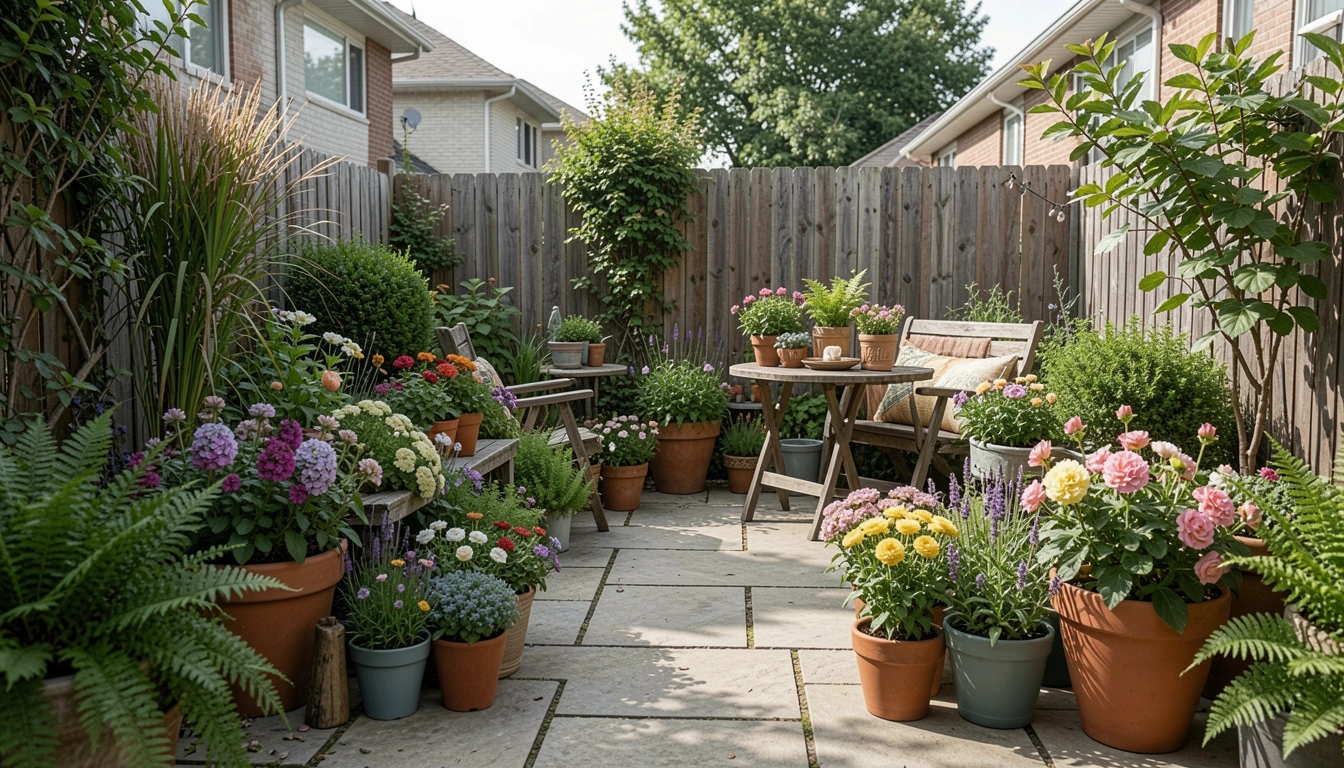
Step 3: Layer heights and textures for a natural, balanced look
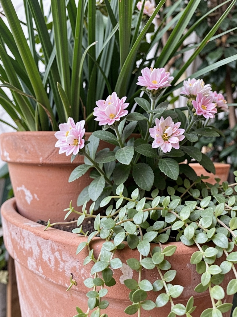
I arrange tall, medium, and trailing elements so they speak to each other. A taller filler foliage sits behind a mid-height flower, and a trailing plant softens the edge. The mix creates depth and movement.
What visually changes is the sense of depth. The arrangement looks fuller from every angle. It feels like a small scene instead of a pile of pots.
People often miss texture. I like a matte terracotta next to a glossy ceramic. A mistake I watch for is stacking too many tall plants in one spot. That makes one side feel heavy.
Step 4: Add birthday accents that feel personal, not loud
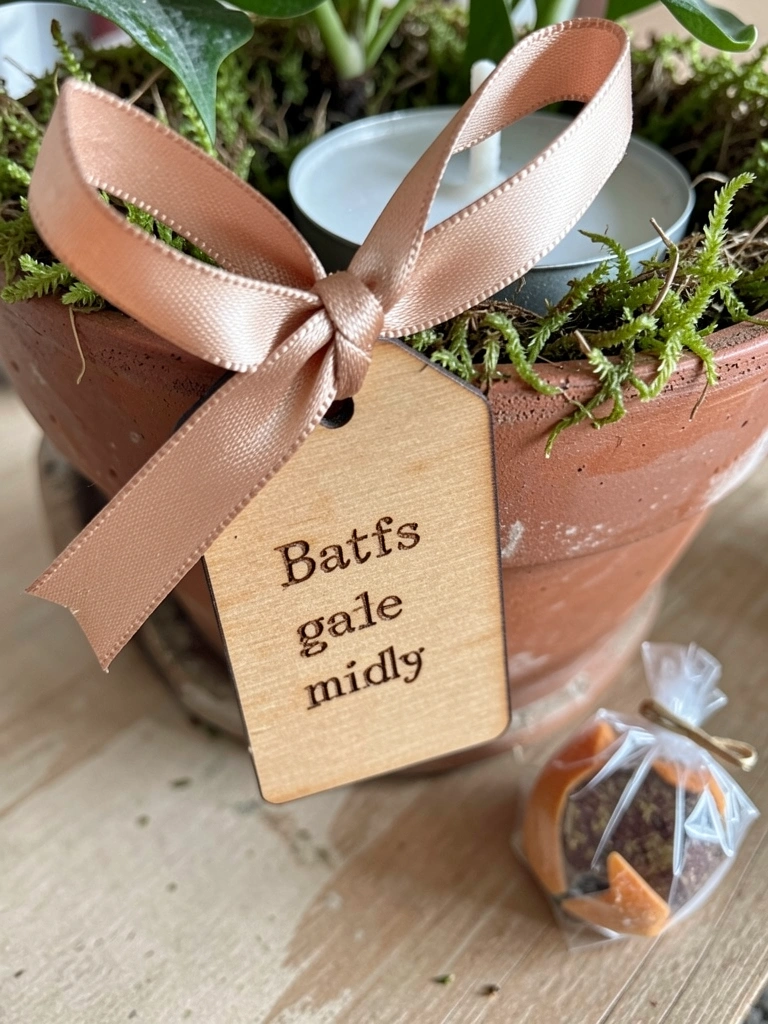
I keep accents small and tactile. A satin ribbon tied to the rim and a handwritten wooden tag make the pots read as a gift. I tuck a battery tea light into moss for soft evening glow.
These little additions change the story. The pots stop being just plants and start to feel like a present left at the door. The scale matters—small touches look thoughtful.
One insight I use is that less is more with accents. A mistake to avoid is cluttering pots with too many props. That tips them from cozy to gimmicky.
Step 5: Group, nudge, and observe from the arrival point
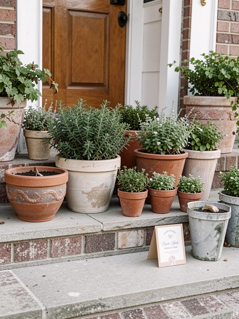
I group pots where the eye first lands when someone approaches. I nudge them off-center and change angles until the cluster looks natural. I step back and pretend I’m arriving, then adjust.
The visual change is immediate. The group reads as intentional and welcoming. Placing a small pot slightly forward creates a gentle path to the door.
People often forget sightlines. I avoid hiding a focal behind a bench or against clutter. A common mistake is centering everything directly in front of the door—off-center feels more relaxed.
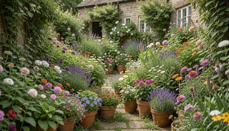
Color and Texture Tips
I work with two dominant textures: soft foliage and bold blooms. That contrast keeps the pots interesting without screaming for attention. I repeat textures across pots to unify the look.
I favor matte finishes with one glossy piece. The mix reads as lived-in and comfortable. If I want more brightness I add a small glazed pot as an accent rather than recoloring everything.
Small checklist I use:
- Two bloom colors max
- One foliage tone repeated
- Mix matte + glossy surfaces
Where to Place Pots
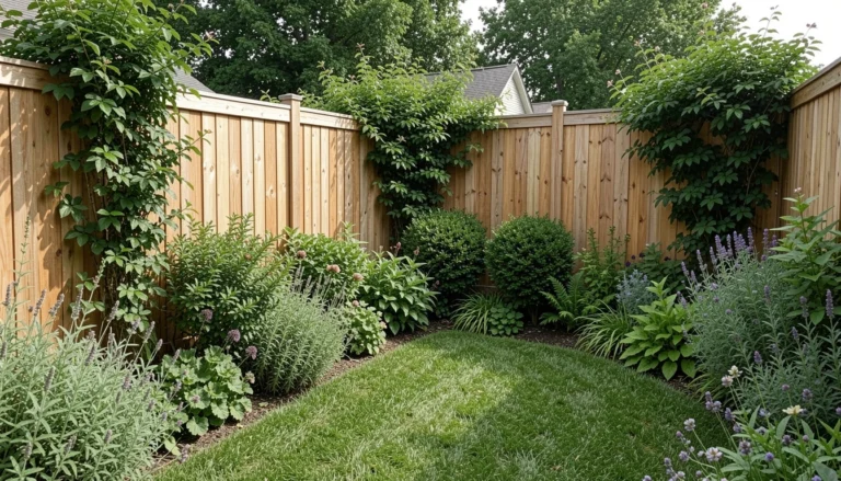
I place pots where they meet people’s lines of sight. Near the door, on a step, or beside a bench are my preferred spots. I think about how someone walks toward the house.
I also consider shelter and footing. A slightly sheltered porch keeps blooms safer and makes the display last through the day. I move pots if the first view feels blocked.
If needed I shift pots at dusk and morning until the placement reads naturally. Little adjustments make a big difference.
Finishing Touches for a Birthday Look
I write a short note on the wooden tag. It sits tucked into moss on the pot rim. That small act changes the plants into a deliberate gift.
I also tie the ribbon in a simple bow and let one tail drape. I avoid oversized bows. I sometimes add a tiny wrapped treat in a small envelope for a personal touch.
These finishing details are quiet. They shift the mood from “nice plants” to “thoughtful welcome.”
Final Thoughts
Start with one focal pot and one repeated color. That small choice carries most of the effect. I find it easier to add than to take away.
Work in short bursts. I make tiny adjustments until the group reads like a gift. It often only takes a few nudges.
When it feels cozy and intentional, I stop. The rest can wait for next time.